Source: Frontispiece of the “Heironymus Corvina” (1488; Florence, Italy), consisting of St. Jerome’s commentaries on the epistles of St. Paul.
This book was commissioned by Matthias Corvina, King of Hungary from 1458-1490, for his royal library in the city of Buda. Like most of the books he collected (now referred to as “corvinas”), this one was commissioned from the great illuminators of Florence. This particular book was illuminated in 1488 by Gherardo and Monte di Giovanni, two brothers at the head of a very prominent atelier in renaissance Italy that produced multiple books for the Hungarian royal library.
Materials:
Pergamenata (regular weight, natural)
23 karat gold leaf
fish glue diluted with water
Windsor-Newton gouaches
Louvre acrylics (deep red background)
Enere Sennelier Or 03 Gold Ink
Design:
I chose this piece to work from for several reasons - for one thing, I wanted to make a scroll for my apprentice-sister based on one of the manuscripts from King Matthias’s library, as it is a current research topic of mine, and she and I even got to see one of the original manuscripts in person (though not this particular one), thanks to a very friendly library curator!
This piece was perfect to do for aforementioned apprenti-seester (aka Letia, LetiaPants, Letia Thistle-butt, etc), because of the lovely sprays of thistles on the top, bottom, and sides. It also had a lot of lovely floral and fruit elements of the type we like to collectively squee over.
I kept most of the elements the same without changing them because they were so fitting on their own, but I did change the color of the belts buckled around the central wreathes to be green instead of pink/red. Firstly, Letia is my apprenti-seester and we have green belts. Secondly, the idea of painting red stripes on green belts was farrr too amusing - Letia’s green apprentice belt actually does have red stripes on it (in the manner of a karate belt), due to the fact that she did indeed Smack Our Laurel In The Face. The stripes are a warning for other wayward apprentices not to get their belt colors confused and accidentally think they are squires. Eep.
Latin Text & Translation:
Why Latin? Because Latin just looks fancier! And it’s period! And soooo totally renaissance Italy! This text was translated by Yusuf bin Abdullah (Thomas Bensing), and can be rendered into English as:
“We heard that you like to bear arms
so we augmented your arms
so that when you bear your arms
they can be augmented
by augmentations.
It’s done!”
...because we are silly, silly people.
Bibliography:
St. Jerome; “Heironymus Covina” / Commentarii in epistolas S. Pauli; National Szechenyi Library, Budapest, Hungary.
Miko, Arpad; The Corvinas of King Matthias in the National Szechenyi Library; 2008 Kossuth Publishing; Budapest, Hungary.
The Mira Calligraphiae Monumenta
War of the Wings VIII
Instructors: Letia Thistelthueyt (spyder.bug@gmail.com)
& Merwenna de Rannowe (csrapp@vt.edu)
Manuscript History at a Glance
- Between 1561 and 1562 Georg Bocskay, court secretary to Holy Roman Emperor Ferdinand I, wanted to show off his skills by making a model book of calligraphy. (No really, he made it almost entirely to show off his technical skill, range of hands, and demonstrate his intellectual value.)
- Thirty years later (1591-96), Emperor Rudolf II (Ferdinand's grandson) commissioned Joris Hoefnagel to illuminate the book.
- Became a visible debate between the two art forms!
Looking at the Manuscript
The Illumination
- Flowers, bugs, small animals, shells, etc. (some real, some imaginary)
- Wealth and sophistication demonstrated by collecting these items (Example: Rudolf II's kunstkammer - "cabinet of curiousities")
- Made in a heavy trade area/seaport - lots of access to exotic items
- Interlaced flowers "woven" through the page
- Nod to memento mori concept via dead critters
- New painting techniques - foreshortening & vanishing point, etc.
The Calligraphy
- Intended solely as a display piece! No rhyme or reason to the written content. Made up of prayers, canticles, psalms, and occasionally imperial briefs and other correspondences.
- Historical, invented, and exhibition hands… Latin scripts include: Italic, rotunda, antiqua (based on Carolingian miniscule), and a variety of gothic styles. Also contains some non-Latin texts, like Greek and Hebrew; and things such as mirrored hands, calligrams, "cut letters", superfluous flourishing, and various other embellished hands.
- Variety in layout from page to page. Each page was created to stun the viewer on its own, not to visually fit into a larger picture, as most SCA scroll sources do.
Making Your Own Scrolls from the MCM
Layout
- Always plan in advance!!! Also, we'd recommend doing calligraphy first, as the illumination is easier to fit in and around the lettering. Great system for collaborative pieces!
- Adaptable! The MCM is adaptable in many ways. Items that would normally be the symbol of an award can be painted as actual physical items (ex. pearl, coral branch - Letia even made a bug that had an opal pattern on its wings!). You can choose a calligraphy style based on personal taste or persona, even if the recipient's persona isn't congruent with the MCM, one could still use an Italian Rotunda hand for an Italian persona and still be period. Round out the scroll with decorative flowers, fruit, small animals, shells, or other natural items that you feel would be appropriate for the award/recipient (ex. dragon!). If nothing strikes your fancy, pick one of the more elaborate (or just filling) calligraphy styles and add extra flourishes or a large capital letter.
- Arrange all of these factors together ahead of time - we strongly recommend sketching out at least rough guidelines of where each element of the scroll will go, just to make sure that proportions and spacing mesh with each other.
Calligraphy
- Proportions of letters to lines to spaces - leave space for illumination AND matte room
- If flourishy, leave out ascenders & descenders - go back, draw in (with pencil) flourishy connections, then ink over (another reason waterproof ink is gooood).
- Quick ways to fancify one of the basic hands mentioned above:
- Use long ascenders or descenders, or both
- Use a basic hand without heavy flourishes, but do three different sizes of writing
- Write wording in an unusual pattern, called a "calligram" - The Mistress Aneira method of doing this: Write out text with the size lettering you want; measure length of all the calligraphy combined; cut a string that length & lay out on paper in desired pattern; "trace" string; write calligraphy along the line..
Illumination
- It's period to make things up! You can use different flowers/bugs than in manuscript, or make up bugs/flowers (ex. Letia's opal-butt bug, Sibry's flowers)
- Shading is very blended and soft; no outlines on the illumination
- Don't forget the shadows on the paper! Keep your light source consistent! If it helps, pencil in a little sun in one corner to remind you where the shadows should fall.
- Sometimes stems go through paper - don't forget the shadow that would be created by the bump of the paper the stem is going under.
- Leave room for a matte!
Kicking Your Scrolls Up A Notch
War of the Wings VIII
Instructors: Merwenna de Rannowe (csrapp@vt.edu)
& Letia Thistelthueyt (spyder.bug@gmail.com)
Finding a Source
- Look for something appropriate for recipient and/or the award being given (based on their persona, interests, aesthetic tastes, heraldry, etc.)
- Some trademarks of particular illumination styles:
Celtic good for animals; gothic styles for figures & animals; later period for scenes with landscape aspects; anything with roundels for lots of badges & heraldry, etc.
- Make sure you pick a source that is deadline appropriate! Don't give yourself a week for a month-long scroll. A panicky scribe is more prone to Titivillus attacks.
- How to find an appropriate source (in obvious but effective ways!):
- Google them! Things to search for: Books of hours, breviaries, antiphoners, bestiaries, Bibles, psalters. Throw in terms like "archery" or "dogs" to find more specific images to fit your theme.
- Via scribal source books: Find the name or number of a manuscript you like and try to find more of it. See if you can find several pages from the same source to give you a good number of images to pull from when designing your scroll.
How to Look at Your Source
Proportions and layout
- What does a normal page look like? How is the book oriented?
- What is the scale of the original source? If you scale it up or down, make sure the smaller details can either be easily fleshed-out or simplified to take up the same proportional amount of space.
- Check your ratios! What is the relationship of text block to miniature, miniature to border, border to margin, etc. Looking at a full page source instead of just parts of a manuscript is a far better way to get an idea of how that style was done in a book. It's even better if you can find multiple pages from the same source. The more you see of it, the more your brain will absorb that particular medieval aesthetic.
Calligraphy
- More proportions and ratios! Letter size, letter spacing, interword spacing, interline spacing, etc. Make sure you use the right size nib for the look you are going for! Some hands are very striking - try to figure out what it is that makes your source's calligraphy look the
way it does. (Ex. Luttrell Psalter, Book of Kells, etc.)
- How much text is on the source? Is the text on a page by itself, or is it surrounded by illumination? Does it fit around or under a miniature, or are they very seperate? Is the text in multiple columns? These factors may affect your decision on whether you want to make a "double page" scroll vs. a single page, and whether you will need to fatten up your scroll wording or trim it down.
- Does the source hand use capital letters within the text, or are they illuminated? Check out the "hierarchy of scripts" - how the beginning of the pages and the beginnings of sentences and new sections are formatted. How is punctuation shown? (Ex. periods vs. line breaks or space-filling illuminated bars).
Illumination
- Margins - do they vary in size? Do they have border lines drawn in?
- Colors! What are they? How is shading done? Are they blended together, or do they stay in their own respective bubbles?
- Are there outlines? (Ex. Flemish - none! Whitevine - sepia! Bar & ivy - black!)
- Which letters are "illuminated" rather than "calligraphed"? Does the illumination interact with the text at all? What parts are touching? Is there any illumination mixed in with the calligraphy (ex. space-filling bars)?
Adapting Your Source into a Scroll
When laying out, calligraphing, and painting your scroll, pay attention to everything you've noticed about your source (outlines, format, everything we've talked about above) - keep them in mind as you work.
- An easy way to plan is to first draw out all matte space, margins, illuminated borders, and space for the text block and any large illuminated letters or miniatures. Next, go through and do the calligraphy in the text block, leaving space for any other illuminated aspects that intrude into the text, such as smaller illuminated letters and filler bars. Then draw out your illumination within the area you laid out, in keeping with the relationships between it and the border and the text block. Paint, matte, frame!
- Don't force some strange entity onto your scroll! One BIG advantage to planning in advance means you can find a source that will let you incorporate what you want without having to do jarringly modern work! Even if one source doesn't have every aspect of something you'd like to include, you can probably find something similar in the same style that you can adapt. This is another benefit of finding several different pages of the same manuscript.
- Going the extra mile! Bonus points for calligraphy - instead of doing a generic hand, say generic, straight-from-the-Drogin-book "gothic", try writing out a ductus ahead of time specifically from your source. Look at how each letter is formed, the length of the ascenders and descenders, and - again - the spacing, etc. A generic ductus may look very different from your source. (Ex. Luttrell Psalter "gothic" vs. early "gothic"… both called "gothic", but VERY different look.
- If you have a source in a non-Latin alphabet, such as a Chinese scroll or a Persian miniature, you can still try to match the calligraphy a number of ways. There are a variety of faux hands available online (Googling for computer fonts is actually very useful in this situation!), or you can swap out for something else that would be appropriate for the period/place that you are more familiar with. (Ex. Persian miniatures w/computer font; Letia's Hebrew/gothic scroll)
- Ignore modern writing rules if you have to! Don't be afraid to medieval-ify your sentence structure. Break words into parts if they don't fit on a line, and if there are too many commas in a particular sentence, who needs them? Being a grammar-nazi isn't period.
MacCon's Coral Branch Documentation
Completed June 2013
Materials
23 karat gold leaf (25 sheets; Wehrung & Billmeir Co. XX Deep Gold booklet from John Neal Bookseller)
fish glue (diluted with water)
"Extra Brilliant Rich Pale Gold" metallic pigment (Neuberg & Neuberg Importers Group, Inc.)
Pergamenata (regular weight; natural)
Sumi ink
Windsor-Newton gouache
Sources
The layout, calligraphy, and illuminated letter are based on the Ramsey Psalter (Harley MS 2904), ff.3v-4. This was made in Anglo-Saxon England during the last quarter of the tenth century, possibly in Winchester. It is named for the Benedictine monastery that it is most likely linked to.
I really liked the strange (and period!) juxtaposition of the bright gold text with the tinted outline drawing style of the time, so I decided to do something based off of that layout. However, I needed more room for calligraphy than f.4 allowed, so I looked at other folios from the Ramsey psalter (specifically those similar to f. 144) in order to adapt the large capital and hierarchy of texts following it into something that could handle being a little wordier, via the lower case miniscule hand.
The miniature on f. 3v was of the crucifixion – not really relevant to an A&S award – so I looked around at manuscripts with that same Anglo-Saxon style of line drawing. I ended up drawing mainly from the Harley Psalter (Harley MS 603 – ff.7v-8) for content and the Tiberius Psalter (Cotton MS Tiberius C VI, ff.13v-14) for a better understanding of the style (I had a bigger, better picture of it). The general whippy sort of movement of the miniature comes from the images that I incorporated from the Harley psalter, but I used the Tiberius psalter when painting the fabrics and defining the different colors of the lines and the very slight, washed sort of shading. Both the Tiberius & Harley psalters are also Anglo-Saxon English, early-mid eleventh century.
Design
The recipient of this scroll is a good friend of mine, MacCon who really helped me get started in the SCA. He received it for his medallion-making awesomeness and commissioned me to make the scroll as he was helping me change my flat tire on the side of the road one night (hence the broken-down cart in the background). He asked for an early period scroll, and while this isn't quite as early as his persona, it's still the earliest style scroll I've ever done! I liked the architecture, landscape, and figures in the Harley psalter, so I used them to draw MacCon and his surroundings. The order badge is a red coral branch, which happened to transfer nicely based off of some of the red, leafy trees in the Harley psalter's landscape.
Process
I drew out the B slightly different from the source gilding knotwork that small is beyond me!) and inked in the penciled outline with diluted ink. Then came the gilding – I used a mixture of about 50-50% water and fish glue. Applied the gold leaf and burnished. Of course it was around that time I realized I had accidentally used the regular weight pergamenata instead of my usual "heavyweight" – so my perg started to buckle really badly under the fish glue. It's flattened out some, and having it in a frame helps, but I am still slightly irked that I didn't notice until that far into the process. Luckily the gold behaved and adhered very nicely.
I painted the entire B before I even drew out the miniature (partially because I was still trying to figure out the logistics of the line drawing). I used about three shades of each color; starting with a middle tone, then going back to add highlights and shadows. I painted the outline of the whole thing in a dark brown gouache. I used gold paint for the smaller letters in "Be it known" and did the rest of the calligraphy in sumi ink.
I drew and inked in the miniature the same way as I did the "B", but instead of painting *in* the lines, I painted over top of them with whatever color paint that part of the picture was to be (so a blue tunic is really just a blue outline of a tunic). It still didn't look quite right, but after taking the advice from my laurel to do the washed shading found in the images of the Ramsey and Tiberius psalters (I didn't see much of it in the Harley psalter), it looked like it meshed with the other half of the scroll much better.
Bibliography
McKendrick, Scot and Kathleen Doyle. Bible Manuscripts: 1400 Years of Scribes and Scripture. London:
The British Library, 2007.
www.bl.uk/catalogues/illuminat… British Library Online Catalog of Illuminated Manuscripts.
Tempera painting, ink, and gold leaf on wooden panels
Inspiration: Coronation of the Virgin by Lorenzo Monaco, 1414; various 14th century triptychs, altarpieces, & panel paintings
en.wikipedia.org/wiki/Coronati…
I think I can safely say this is the biggest project I've ever done in the SCA. When Her Majesty asked me if I could make their ducal award scroll, I was super excited and honored – and mildly panicky when she said they wanted something big and shiny. I had been thinking along the lines of a fancy Russian scroll; maybe painting ducal Russian nesting dolls; or perhaps a panel painting, which I had always wanted to try. Turns out a panel painting was sort of what Her Majesty had in mind, but in the shape of a triptych. Eek! Thus began the adventure of my very first panel painting!
Once I started looking at sources, I couldn't help but get excited and start making plans. I wanted to make a period-looking triptych and use as many period techniques as I could while remaining within the budget, time frame, and my level of ability. Obviously there was no way I could do everything from scratch, and along the way some things turned out to be done in a more period way than I had planned (hinges!), and others less so (augh! bole!). Luckily it balanced into a decently period look. It got done! Hurrah!
A lot of people helped me out during various stages of this project, and I'd like to thank them all forever and ever and ever. First, thanks to Vladimir & Kalisa for providing the project and funding for something I'd never have gotten to do otherwise. Rowan of Hawkridge was my builder and consultant – she helped me figure out how to put together the physical pieces I wanted that would actually form the triptych. Solvarr Hamarsson showed me how to make hinges and he made the ones for the triptych from scratch. Mistress Livia Zanna was forever answering my questions about anything chemical or paint related, and saved me from a lot of time-consuming screw-ups. My apprenti-siblings Letia Thistelthueyt and Eilionora of Black Diamond would always listen when I needed to fret, and my laurel Mistress Aneira had to have answered a million of my panicked phone calls and facebook messages during the past few months. Yusuf bin Abdullah was an excellent cat-wrangler, paint-cleaner, support-giver and chocolate-supplier during the whole project, and there's no way I could have finished this project on time without him.
Building
Starring Rowan of Hawkridge; special thanks to Wistric & Sunneva for letting us trash their garage!
Materials
-plywood boards
-rope moulding
-picture frame moulding (2 sizes)
-edge banding
-column caps/bases
-woodglue
-clamps
-nails
-wood filler (goey liquid sawdust)
-thin bass wood for small architectural details
-fancy wood applique designs
Process
After perusing lots of pictures of triptychs, I had a pretty good idea of what I wanted mine to look like. I loved the gothic architecture aspects in triptychs like the ones pictured in the "structural and architectural inspirations" part of this documentation, and I wanted the shape of the triptych as well as its internal design (both structurally and as part of the painting) to reflect those.
I drew out several small designs of what type of structural embellishments I wanted and talked to my laurel as well as several other people about how I could make them using wooden edge moulding. Rowan of Hawkridge had built triptychs before and was friendly with the hardware store, so she became my shopping partner and purchasing consultant. She helped me pick out all of the above-mentioned materials based on my design. She was also quite handy with power tools, so instead of losing my limbs in a freak mitre saw accident, Rowan handled most of the slicing and dicing.
Rowan took my design and used a jigsaw to cut out the panel shapes I had drawn on the plywood, and then she showed me how to apply edge banding to hide the ugly plywood edges. We measured the borders of the panel for the moulding and she used a mitre saw to cut the moulding into the correct lengths and angles needed for each side and joint. We used a handsaw to cut the column caps because the mitre saw liked to fling them into the depths of Wistric and Sunneva's garage when we tried to use it on them (…we never did find them all). Once all of the moulding and architectural bits were cut out (using a combination of Rowan with a jigsaw and me with an x-acto knife), we attached them with wood glue and clamps. Once it was dry, any gaps were filled with woodfiller. (There weren't very many – Rowan is pretty hand with a saw.)
Preparing the Panel
Materials
-easy gesso from naturalpigments.com (mixture of rabbit skin glue, chalk, & marble)
-Minwax woodstain (woodstain & polyurethane varnish in one)
-sandpaper (several grain varieties)
-extra chunk of panel to apply test samples of stuff to
Process
For most of the panel prep and painting processes, I followed the instructions from temperaworkshop.com fairly closely. A few times I ended mucking something up and having to improvise, but their website was my jumping off point.
The first thing I needed to apply to the panel was gesso, to provide a smooth base for the bole for gilding, and an immaculate(ish) white base for the tempera painting. I used mixed the gesso powder – consisting of rabbit skin glue, chalk, and marble – with warm water and let it gel for two hours. Once it had gelled, I heated it in a pot of hot water to liquefy it so that it could be painted on in thin layers, one at a time. Each layer took about a day to dry completely, and each layer had to be sanded after it had dried. In addition, some leaked over onto the sides that I intended to stain, so I had to remove the drippage with a razor blade. Applying the gesso alone took four days for four layers.
Moronically, I applied the gesso before I stained the back of the panel, so when I painted on the Minwax stain per their instructions, some of it dripped onto the other side and oozed onto the lovely gesso surface. I could sand some of it off, but some was allowed to remain, and it was mostly covered later with the bole. I wanted to use the stain both to give the plywood a nicer color and to give it a few layers of protection. It was my first time using any sort of woodstain, and I am sad to admit it was a bit more challenging than I anticipated. Heh. (Note the cat hairs that got stuck in the stain near the bottom.)
I adapted my design for the triptych from an Italian altarpiece depicting the Coronation of the Virgin, completed in 1414 by Lorenzo Monaco. It is a large piece done in tempera on a wooden panel, with ornate carvings and gilded background. Despite the source being done all on one large panel, it was divided by three distinct arches, which I thought would translate well into the triptych style I wanted. Once I knew the number of people I would be painting, this layout seemed perfect.
I drew out the design on separate pieces of paper sized to the same measurements as the three panels. I then used transfer paper between my drawings and the gessoed panel. For the following steps of gilding & painting, all I had to do was stay in my lines. (See pictures on "Drawing & Painting" page!)
Gilding
Special thanks to my laurel, Mistress Aneira, for answering all of my panicked phone calls and helping me maintain perspective, and to Mistress Livia for knowing things all sorts of cool stuff about chemicals.
Materials
-Armenian bole (from Talas – red clay-like paste used as colorant/base for gilding)
-gelatin (mixed with bole)
-fish glue (diluted with water)
-23 karat gold leaf (25 sheets; Wehrung & Billmeir Co. XX Deep Gold booklet from John Neal Bookseller)
-"Extra Brilliant Rich Pale Gold" metallic pigment (Neuberg & Neuberg Importers Group, Inc.)
-egg tempera (basically just egg yolk)
Process
Period gilding on panel painting was generally done over gesso and bole, with bole applied over the gesso specifically in the areas you planned to gild. That part was pretty easy to figure out. However, out of everything I had bothered with so far, I think interpreting the directions (or lack thereof) for the bole was the worst.
Talas Armenian bole claims to be "ready to use" – implying that you could just apply it and gild - but after applying it in multiple layers to one of the three panels, I discovered that that might not actually be the case – it might need an added binder (something sticky) added to it in order to actually adhere to both the gesso and the gold leaf when it is applied. (Something I had assumed was already in the "ready to use" bole.) The tempera workshop website made bole by combining bole clay with gelatin, and I assumed that I was able to skip that step. Probably not, it turned out – though I still don't know for sure. False advertising!!! After a mild panic attack, I began scraping off the bole applied to the left panel, which proved to be a painstaking and generally futile pursuit. I had a conversation with Mistress Livia about my woes & she suggested just applying another binder over top of the bole. With that suggestion, I reapplied what little bole I had managed to scrape off, applied a mixture of 50% fish glue and 50% water on top of it, and let it dry per my usual gilding method.
The method described in the tempera workshop website involves successive layers of gelatin/bole mixture being allowed to dry, smoothed down, and then rewet several times before laying the gold down immediately after wetting the bole again. This is what I attempted on the second panel I did – the right panel. I wanted to properly follow directions, dammit! Unfortunately, the gold did not cooperate as well nor look as shiny as it did on the left panel, with the fish glue. Less than halfway through, I reverted to the other method, this time with the bole having gelatin in it as well as fish glue on top of it. I used the bole/gelatin mixture again on the third panel & just went ahead and applied the fish glue as well instead of trying to follow directions. It turned out a better result and was actually far less time consuming.
Laying the gold leaf was fairly standard over the fish glue, and other than the few spots where I tried to apply it with the bole/gelatin mixture only, it shined quite nicely. Of course, there were a few spots that I didn't manage to cover with leaf for one reason or another (I only had 25 sheets for three whole panels, after all), but the method used for gilding turned out to work well with the gold imitation powder from Neuberg. "Huffing" on the fishglue to reactivate the binder and then brushing on a layer of imitation gold flakes turned out to be an almost seamless way to cover any mistakes in my gilding technique. The powder miraculously matched the leaf almost perfectly. In the right light, you can see where the square leaves of gold lead end and the powder begins, but in most light the shininess is so dazzling that it's hard to tell unless you know what you're looking for. I really lucked out with that powder. (Another thanks to Mistress Livia for the recommendation!)
I made the decision to use the imitation gold powder for the border moulding before I began gilding due to my concern for how the panels would behave when closed on top of each other. I didn't want the binders below the gold leaf to adhere to the opposite panel and risk ripping off chunks of gold leaf, so I decided to use paint there instead. It also allowed me to experiment with egg tempera as a binder before I started painting the figures, so that was a plus. Overall it worked well – I had to apply it in layers, which was annoying after the relative ease of achieving opacity with the gold leaf, but it turned out looking okay once it completely dried. A few places concerned me by developing what looked like cracks in the paint, however, and I am still unsure of why that is. It added some nice period-looking character, though, and rather than screwing up more obvious parts of the triptych by trying to fix it, I allowed them to remain and hoped they were inconspicuous enough that I could get away with it.
Also – not sure if it was supposed to be, but the gold pigment/egg tempera mixture was hella smelly.
*more on these border moulding issues in the "Painting" section below…. Oh dear…
Making the Hinges
Starring Solvarr Hamarsson as hinge-making blacksmith extraordinaire!
Materials
-forge
-bronze strips in various sizes
-brass tacks
-homemade chisel
-bendy-tool that curved each piece of metal
-hammer
-small drill to make holes in hinges...
Process
Basically I didn't do much for this part, but I got a first-hand look while Solvarr did all the hard stuff. We ended up making two batches of hinges – the first one being a sort of test run. The first load was cut down to size after shaping each piece, the second load was pre-cut to a consistent size before we began and then sanded to fit specifically where it would be placed on the triptych. Other than that, the process was pretty much the same for both batches.
Solvarr began by heating the bronze in his forge. He then used a tool that he had made himself to bend the metal strips into a curved "U" shape. The "U" shapes were then hammered flat while holding a bronze dowel through their middle to create a sort of "P" shape. Two "P" shapes were required to make each hinge.
Each "P" shape was then divided on the hollow part of the "P" with two small lines, creating three equal sections. According to what part of the hinge it was to become, either the two outside sections or the one middle section was then hammered flat and sliced out with a (homemade!) chisel. When one of each of these pieces were threaded together on bronze dowel, it created a functional hinge.
Each piece was then sanded on its edges and in the areas where it had been cut in order to fit together properly and to be safe & pretty when placed on the triptych. We measured out the spots they would be placed on each side, and then Solvarr marked each hinge where a hole would be drilled. He drilled six small holes per hinge, and each hinge was attached to the sides of the triptych boards using six brass tacks.
Painting
Materials
- variously-sized paintbrushes
-egg yolk (base of the binder for egg tempera painting)
-water
-ground pigments from NaturalPigments.com and from random generous laurels (thanks Livia & Aneira!)
- gum Arabic
- imitation gold pigment (see gilding section)
- Higgins ink
Process
It's a really good thing that I did the gold border tempera painting before I started painting the figures (back in the gilding section of this documentation), because otherwise I would have screwed up the important part instead of the less-important, more easily-fixable part. After doing a lot of digging around in various online forum discussions, I figured out that I tempered the paint for the borders wrong, which is why they were a little cracky in some places – they will probably get more cracks as they age. Bleh! For the portraiture part of the painting, I made sure to water down the paint to the recommended consistency and to paint very, very thin layers using very small strokes. It nearly killed me, because that's not usually how I paint (normally I paint with gouache, which is much quicker, in my opinion). However, the gradual building up of layers in various washes & shades is what gives tempera panel paintings their translucent, sometimes opalescent qualities that are so cool – so I accepted my suffering….
- until I needed to paint lots of thin tiny black lines. That's when I started using ink. For the sake of speed and efficiency, I started using watered down ink to get more lines done quicker. Over top of the tempera layers I had already painted, the sheen of the surface stayed the same and it allowed me to get finer lines a lot faster. I started using it primarily while painting the throne – lots of thin little lines. Bleh!
For painting most everything, I started with a medium tone and then built up layers to get it more opaque . After I had achieved the basic color/structure I wanted, I went back and shadows and highlights in other colors or shades. For example, Ysane's dress was done with a deep red pigment. I shaded it in a dark blue and highlighted it in orange. Tedious process, and kinda boring. My favorite part of painting, however, was probably the most tedious. After I had built up all of the basic garb, I got to go back and add accessories, trim, embroidery, necklaces, belts, etc. I loved this part because I am a major garb fangirl and love to do fashion illustration. It took forever, but it was definitely the funnest. Her Majesty Kalisa asked that everyone be depicted in their usual period garb with a few specific requests, as well as wearing their award regalia. They didn't want to wear pointy ducal hats or have others in coronets, which was great because it meant I got to paint some awesome Russian hats.
The last part was doing the faces and adding finishing touch-ups. I hate portraiture. I apologize to everyone I have ever tried to draw or paint – I can't make people look like themselves to save my life. I have to rely on the garb to identify people when I paint them on scrolls. So, adding the faces was kind of painful because they seemed much cruddier than the stuff I had painted up to that point.
I was going from at least one or two pictures apiece when painting the little miniportraits. A few things I had to fudge - medallions got cobbled together with necklaces or other bling, edges and trim were partially imagined, and several other things were exaggerated or hidden somewhere unobtrusive so that I didn't have to paint them. Flaithri's Pelican medallion was cobbled together from two pictures of two different medallions because I only had access to one of them in the last week of painting - and Rhonwen was laureled one week before this was completed, so I went back and added a new laurel medallion to an existing necklace (I hadn't found a picture of her actual medallion yet). I couldn't find pictures of Ysane or Ella wearing their Golden Dolphin medallions, so they both got standard medallions on a simple chain.
I think what ended up making it look even wonkier was me trying to look between a photograph of the person to a period painting of a person in a similar pose. Trying to paint a sort of vague medieval expression on everyone instead of whatever (occasionally goofy) expression they were making in a photo made it even harder to figure out how to paint an accurate portrait in a medieval style.
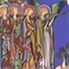
From left to right:
Ysane, Seonaid, Ella, Christiana, Rhonwen – Kalisa, Vladimir – Angus, Flaithri, Roland, Aedan, Theodora
Calligraphy
Originally I was planning on doing the calligraphy in gold ink from a dip pen on the ultramarine blue carpet. However, despite testing the pen, as soon as I put it to the panel, everything was sucky. Thus, the first two words appearing on the triptych are considerably more derp than the rest, which I ended up painting in by hand, very slowly, with the ink made of the imitation gold pigment and gum arabic.
I chose to put the calligraphy on the carpet in the central panel because it seemed to be the only logical place to put it. When looking at the source pictures I could find of Coronation of the Virgin, I *think* there might have been words along the very bottom of all three panels, in gold on a dark background. I'm not sure, though, because I can't find a decent enough picture…. Soooo, carpet! I figured it was close enough. Instead of having a section of gold carpet within the blue, I chose to just put gold calligraphy on top of the blue section and hoped that it would look nice with the decorative gold stars scattered throughout the rest of the carpet. It took longer than I wanted but at least it turned out shiny.
Sources
temperaworkshop.com/. 2013. Technique tutorial.
Late Medieval Panel Paintings: Materials, Methods, Meanings. Susie Nash. Contributions by Till-Holger
Borchert, Emma Capron, & Jim Harris. Paul Holberton Publishing, London. 2011. First published to
accompany an exhibition by Sam Fogg in London.
THE INTERNETZ AT LARGE.
Things I Would Like to Go Back & Fix…
-probably would not make this project my first attempt at a panel painting. A little more practice might have gone a long way with some of the mistakes I made…
- icky border made of sticky, badly-mixed tempera
- edges of gold paint both along the stained edges and the interior painting are uneven and poorly mixed
- NO MORE FACES EVARRR – no longer want people to look like creepy frog versions of themselves
- need longer brass tacks to hold hinges on better
- need to make bottom heavier to prevent top-heaviness & unsturdiness when standing